Hypothesis: A senior-friendly kiosk design will reduce tech support requests by up to 30%.
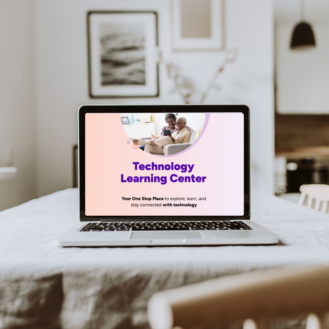
Portfolio Case Study: Senior Kiosk Design
Project Overview: Project: Senior Self-Service Kiosk
Goal: Enable seniors to browse programs, workshops, and digital resources independently while reducing staff workload.
My Role: User experience designer
Designed task-focused user flows for key kiosk interactions
Created consistent and accessible kiosk web pages
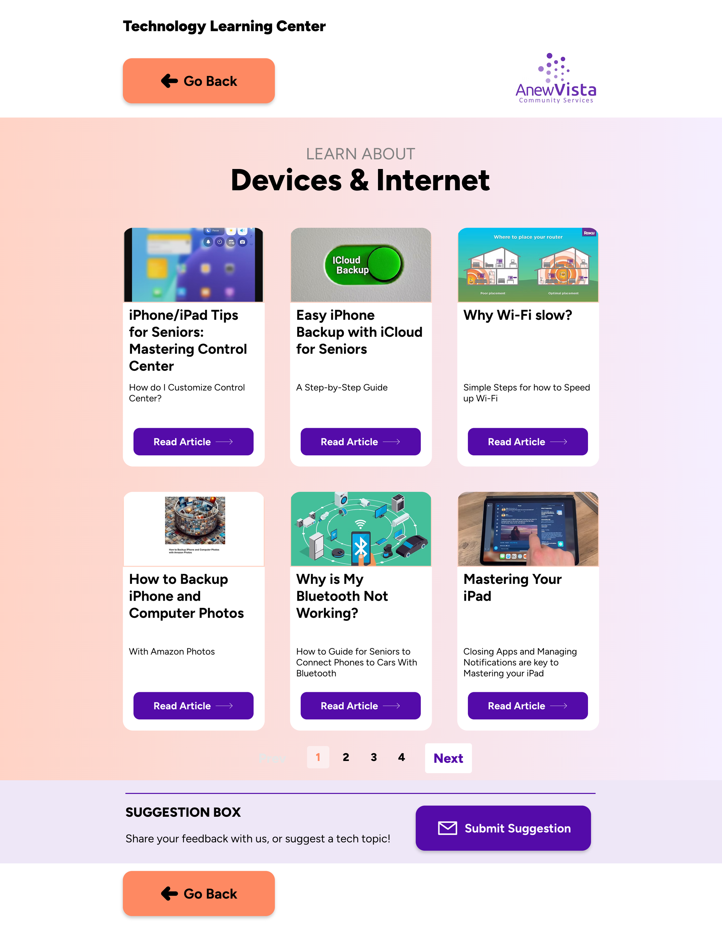
Suggested pagination and other senior-friendly design patterns, and categorized blog information for easier navigation.
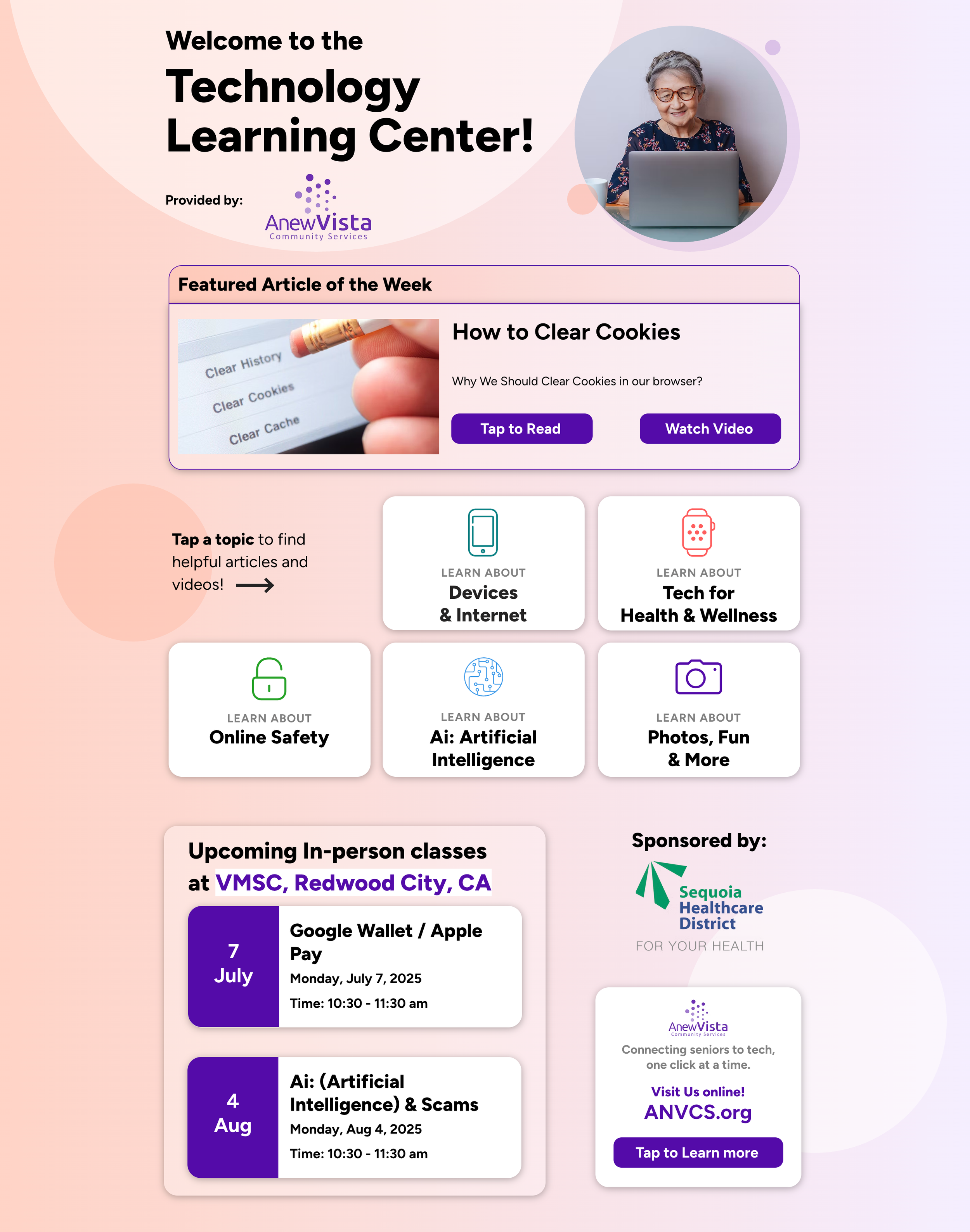
Designed pages with minimal information and clear layouts to reduce cognitive load for senior users.
Problem I am trying to solve:
Seniors struggled to access digital resources and programs independently, relying heavily on staff for assistance. Staff were spending significant time on basic tech support, limiting their ability to focus on higher-value activities.The kiosk needed to provide a senior-friendly, self-service interface to improve independence and engagement.
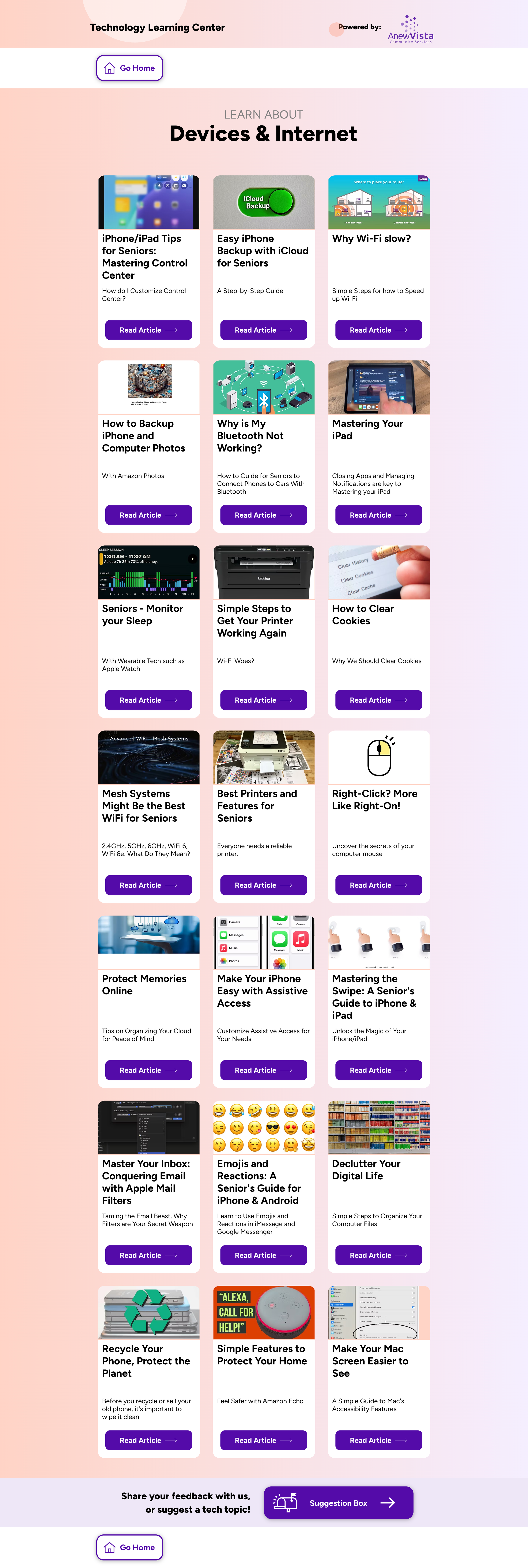
Categorization Approach:
Grouped the blogs into the following categories:
Device Tips & Tutorials (11 posts)
e.g., Easy Streaming for Seniors, Declutter Your Digital LifeHealth & Medical Tech (3 posts)
e.g., Managing Your Health on the Go, Refilling Prescriptions Made EasyDigital Organization, Productivity & Writing (5 posts)
e.g., Level Up Your Writing, Taking Hassle Out of LoginOnline Safety & Security (6 posts)
e.g., How Seniors Can Spot Phishing Emails, Passkeys for SeniorsCommunication & Fun (4 posts)
e.g., Fun with AI!, Emojis and Reactions GuideDigital Payments & Shopping (2 posts)
e.g., Tap to Pay, Score Big on Black FridayHome Technology (2 posts)
e.g., Smart Homes for Safety, When Technology Turns DeadlyEnvironment & Recycling (1 post)
e.g., Recycle Your Phone, Protect the Planet
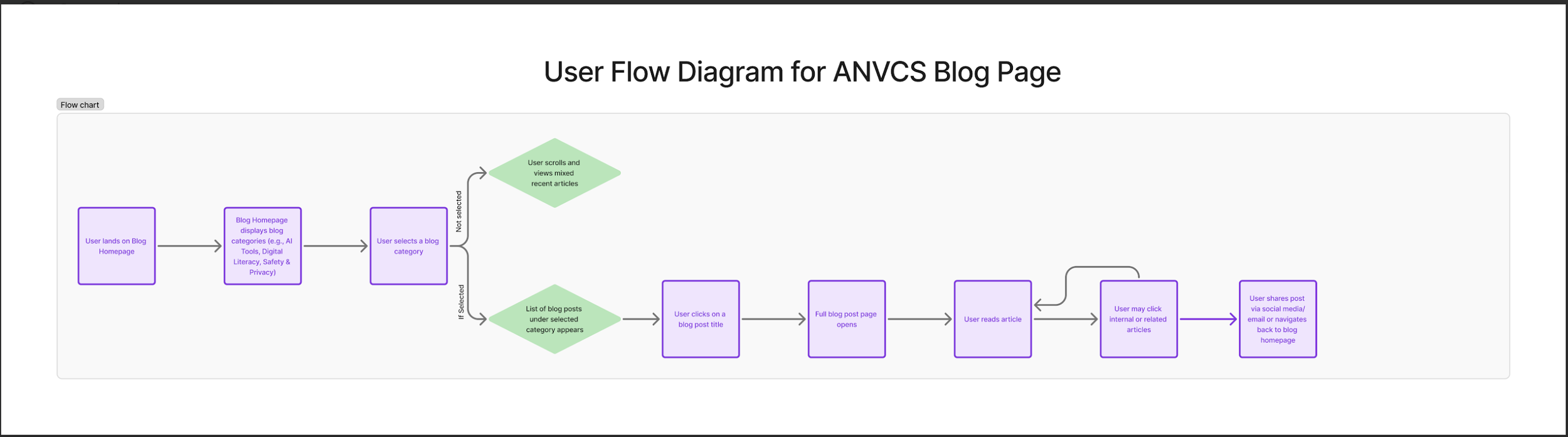
User Flow Diagram:
Previous Kiosk Designs:
New Revised Designs: Implemented pagination on the blog page to reduce cognitive load and make content easier to browse.
New Revised Designs: Implemented pagination on the blog page to reduce cognitive load and make content easier to browse.
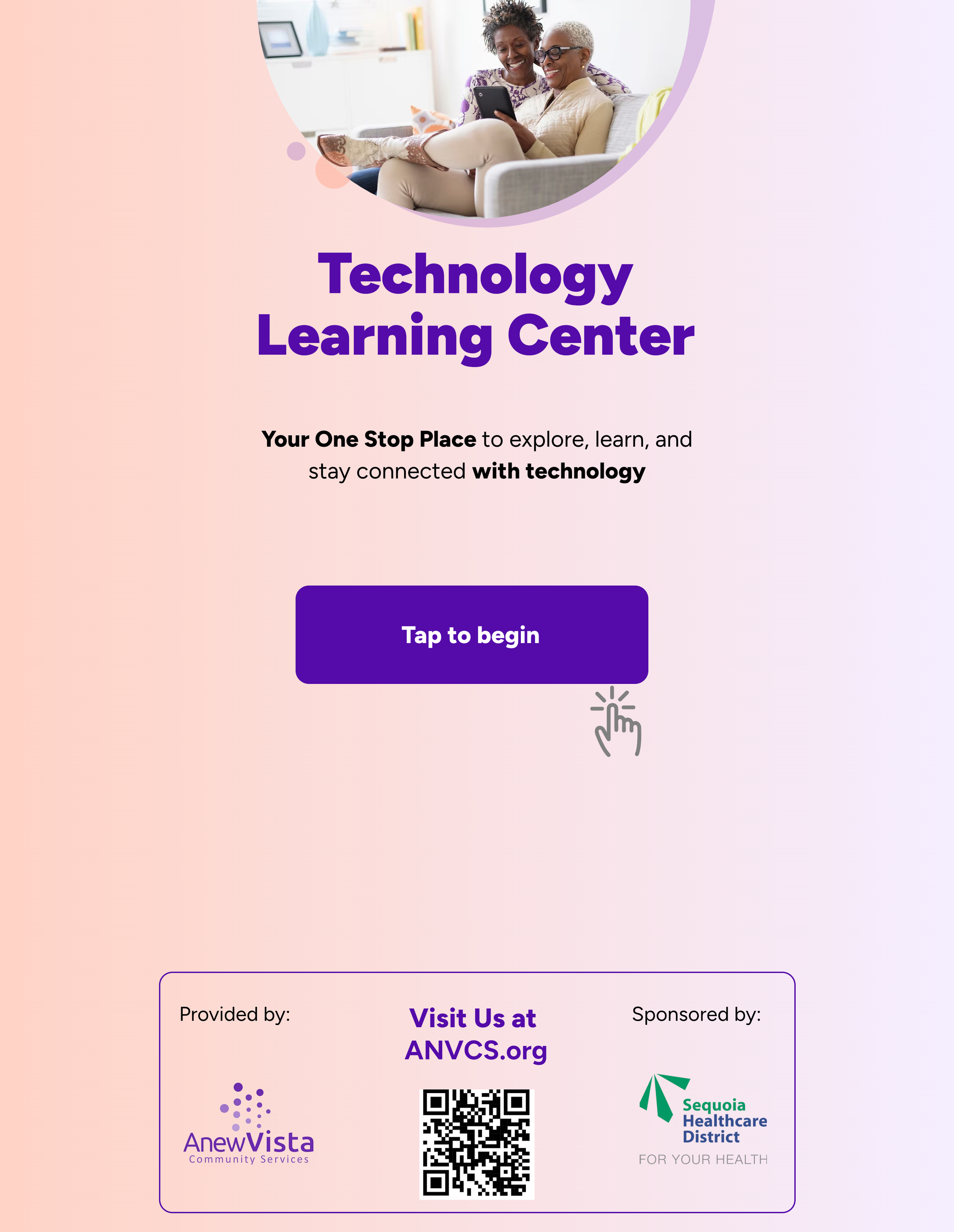
A finger touch icon was added to the 'Tap to begin' button to provide a clear visual cue that it is interactive. This supports usability for first-time and low digital literacy users, aligning with inclusive design principles.
Key Learnings & Outcomes
This is an ongoing project. We plan to test with a larger number of users and are currently implementing metrics to measure effectiveness. One important learning so far is that not all designs work the same for seniors — presenting too much information in one place can be overwhelming. Simplifying layouts, prioritizing key actions, and breaking content into smaller steps has shown better engagement and ease of use for this audience.