By mapping user friction in Satvik’s online flow, we uncovered opportunities to reclaim lost revenue—modeling a 66% conversion increase and $48K growth. Enhancing user experience through research-led design improvements.
Limited transparency, fragmented checkout, and a cluttered interface disrupted trust and purchase flow. Our proposed UX improvements streamline the ordering experience, enhance ingredient clarity, and support faster decision-making
Company : Satvik Eggless Bakery https://satvikegglessbakery.com/
Role: UX Researcher & Designer | Collaboration: Team Project
Industry: E-Commerce
Timeline: 11 weeks (Feb 2025 - May 2025)
Professor: Jessica Lannuzzi
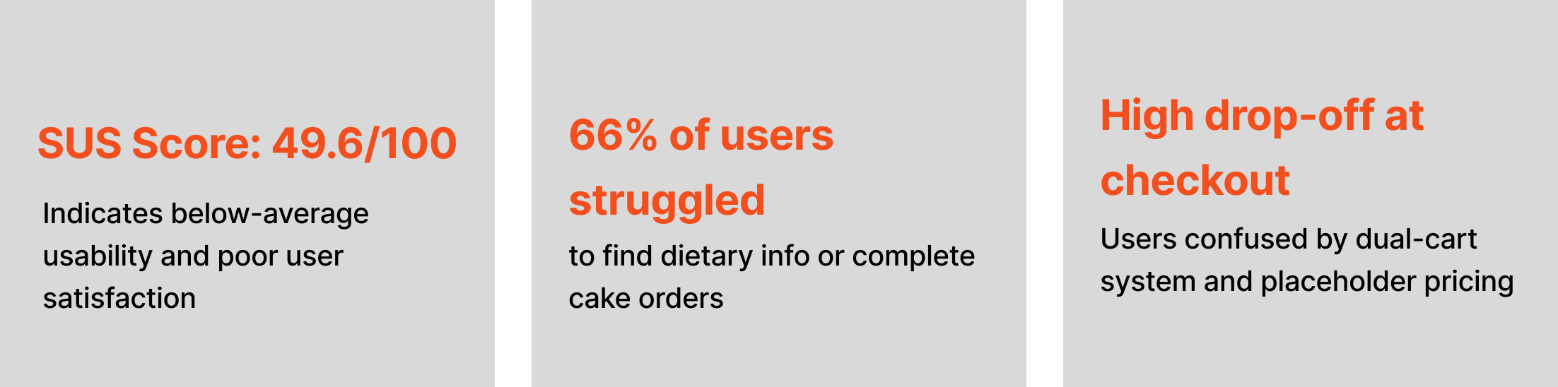
Pre-Redesign Metrics
System Usability Scale (SUS): 49.6 / 100
Indicates below-average usability; users reported confusion with pricing, navigation, and layout.
Why was this project undertaken?
This project was undertaken as part of a UX Research course, with the goal of applying real-world research and usability evaluation methods to an existing website. Satvik Eggless Bakery’s website was selected due to noticeable usability issues that impacted the online customer experience.
What Was the Business Trying to Achieve?
While we did not speak to actual stakeholders, the business objectives were inferred based on user research, usability testing, and analysis of the existing site. Satvik Eggless Bakery, a California-based bakery specializing in eggless and vegetarian desserts appeared to be aiming for the following goals:
1. Increase Online Sales
2. Streamline Custom Cake Orders
3. Build Trust Through Clarity
4. Reduce Operational Load
5. Improve Brand Credibility
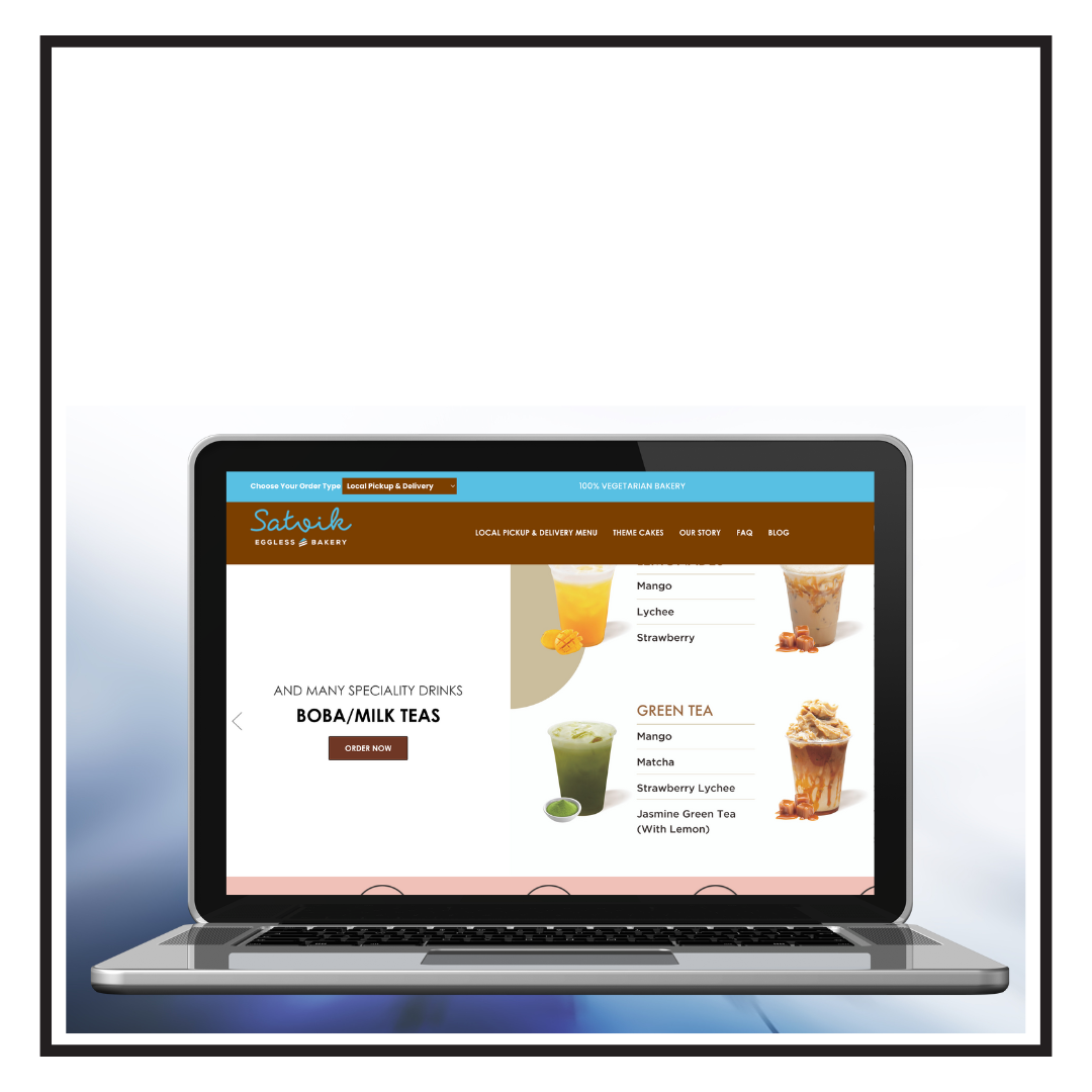
Company Overview: Satvik Eggless Bakery is a California-based bakery that specializes in eggless, vegetarian, and vegan baked goods. It caters to health-conscious customers and those with dietary restrictions or cultural preferences that avoid eggs. The bakery offers a variety of products including cakes, cookies, pastries, and custom-made treats, with an emphasis on high-quality, fresh ingredients.
Problem Statement:
While the business has a strong local presence, its website lacked clarity and ease of use. Initial observations reveal customers with dietary restrictions seeking healthy dessert options face challenges when placing online orders on Satvik Bakery’s website. The overcrowded homepage, unclear menu structure, and inconsistent design create frustration and reduce trust in the ordering process. Improving the site’s usability could enhance the user experience and support customer retention and growth.
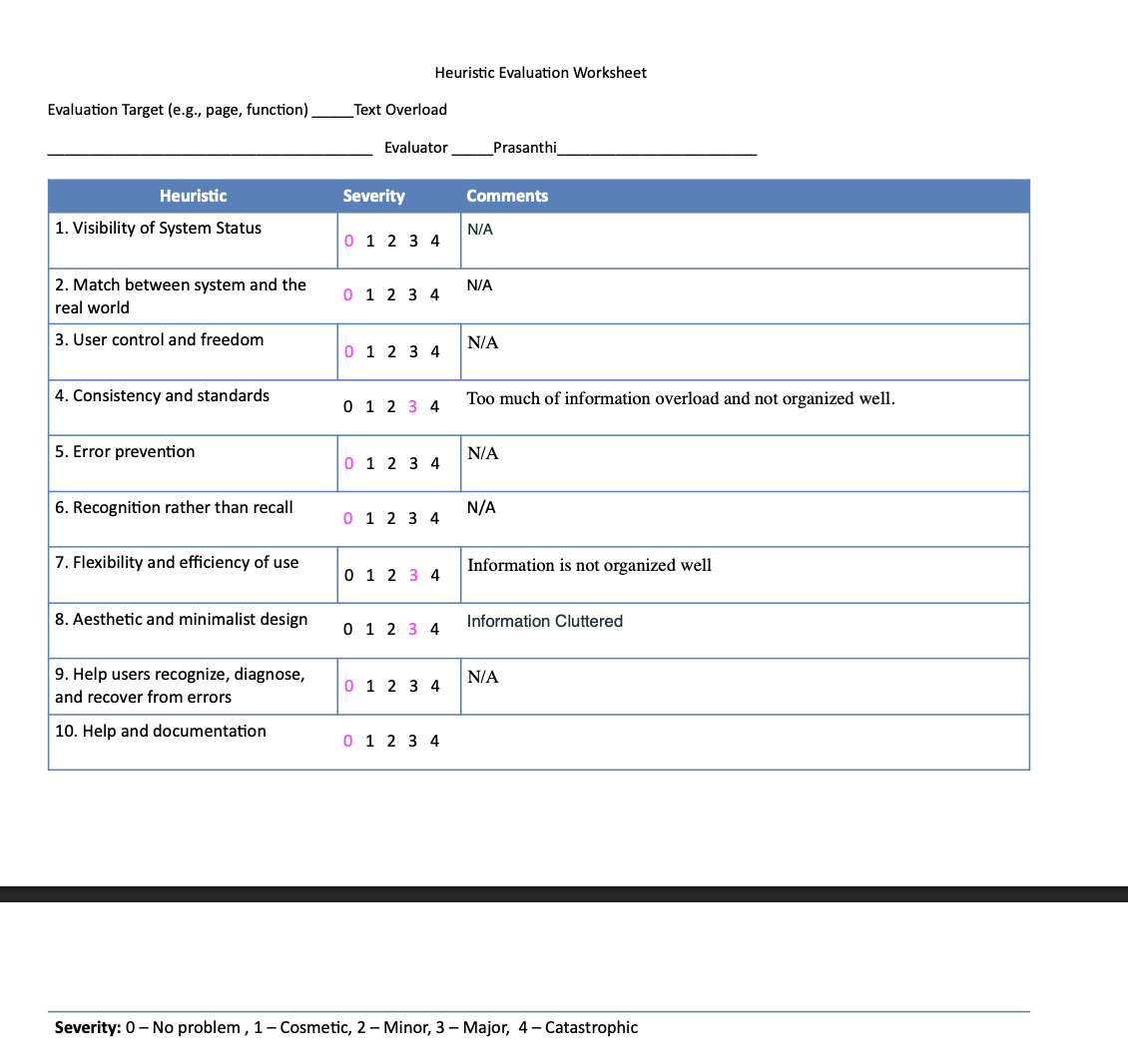
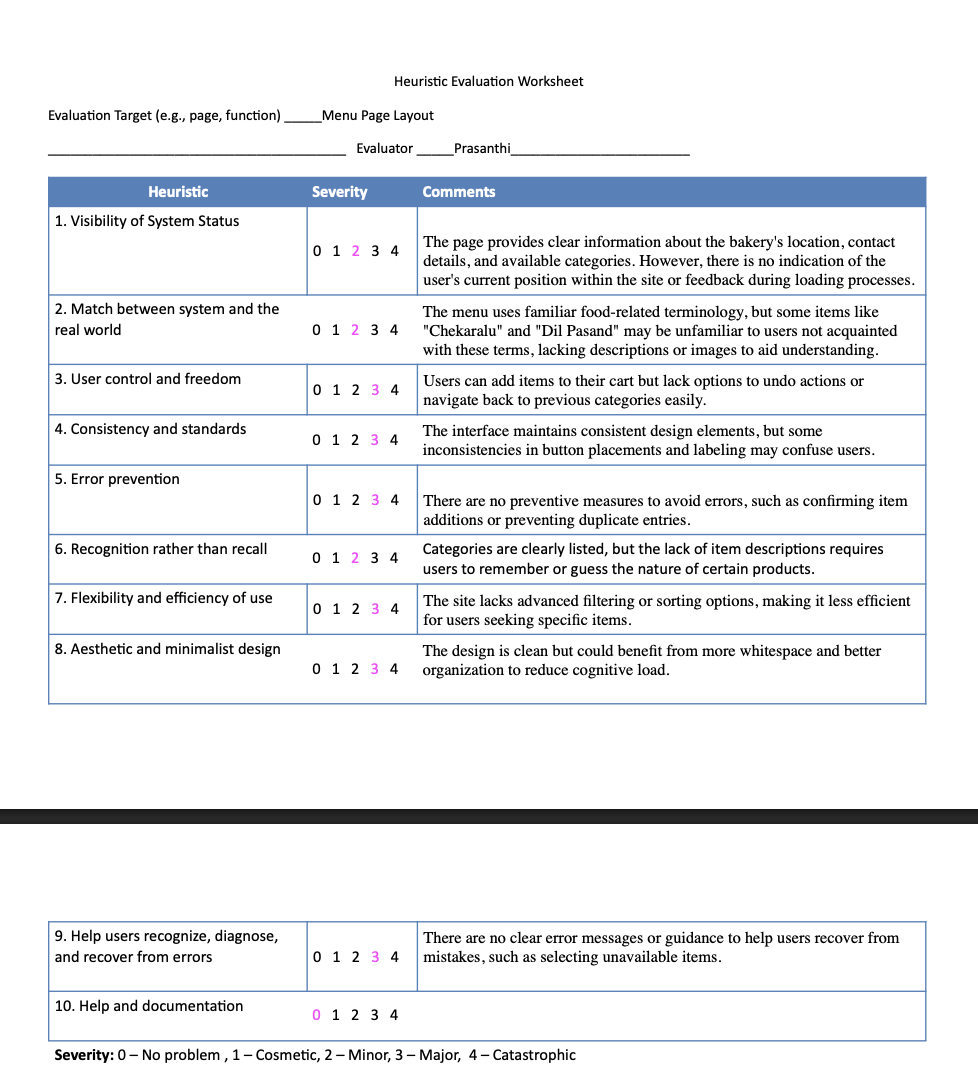
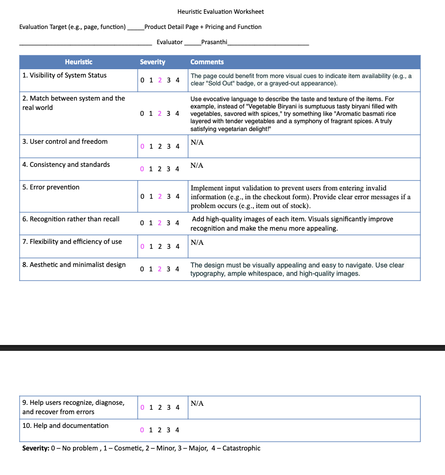
UX Research Methods: To better understand the usability challenges on the Satvik Bakery website, we began by conducting a heuristic evaluation using Jakob Nielsen’s 10 usability heuristics. This helped me to systematically identify key issues related to navigation, visual hierarchy, and overall user experience.
Heuristic Evaluation:

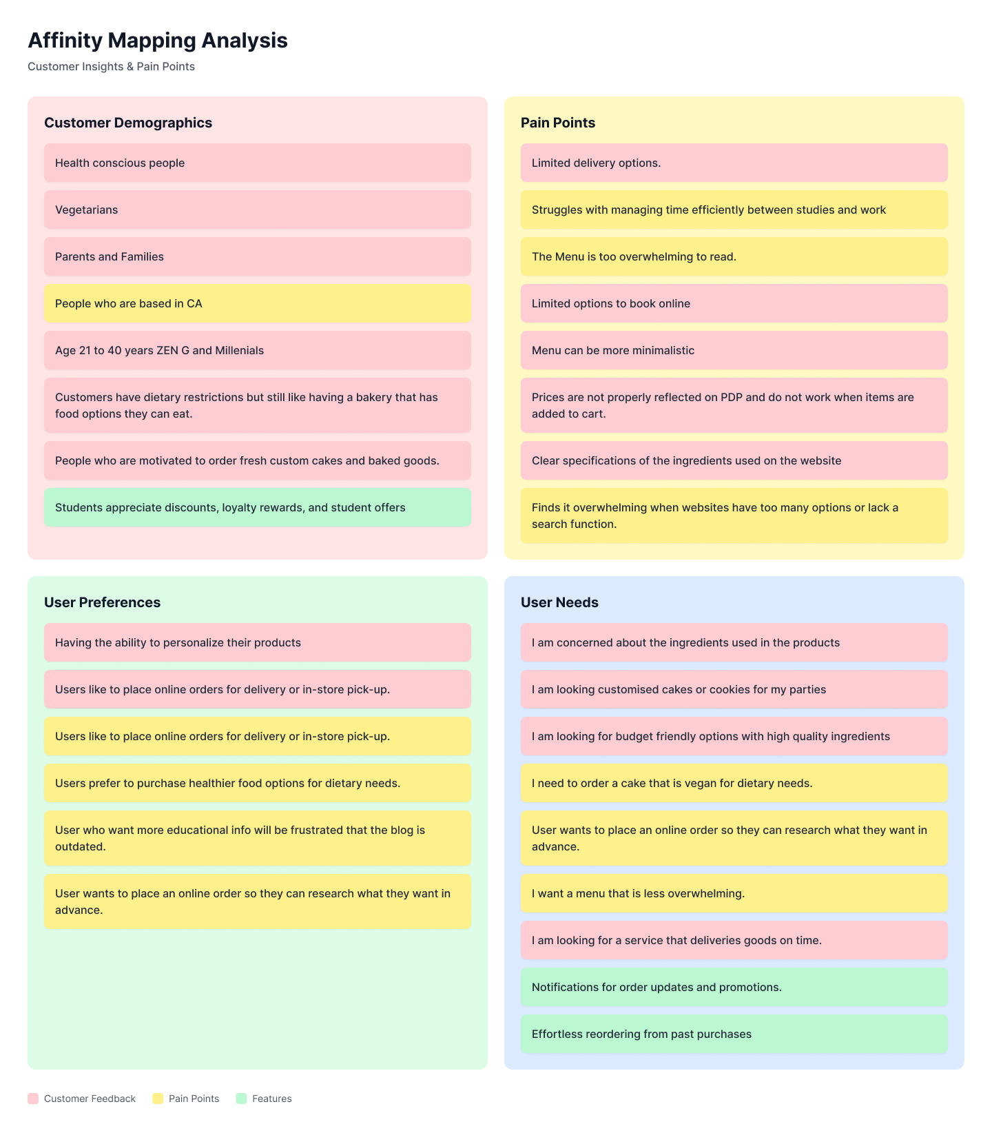
Provisional Persona & Affinity mapping:
We created affinity maps and provisional personas before conducting user interviews to establish a foundational understanding of potential user types, their pain points, and expectations—based on heuristic evaluations, assumptions, and secondary research. Heuristic evaluation and provisional personas helped us identify key user behaviors and better understand our target audiences.


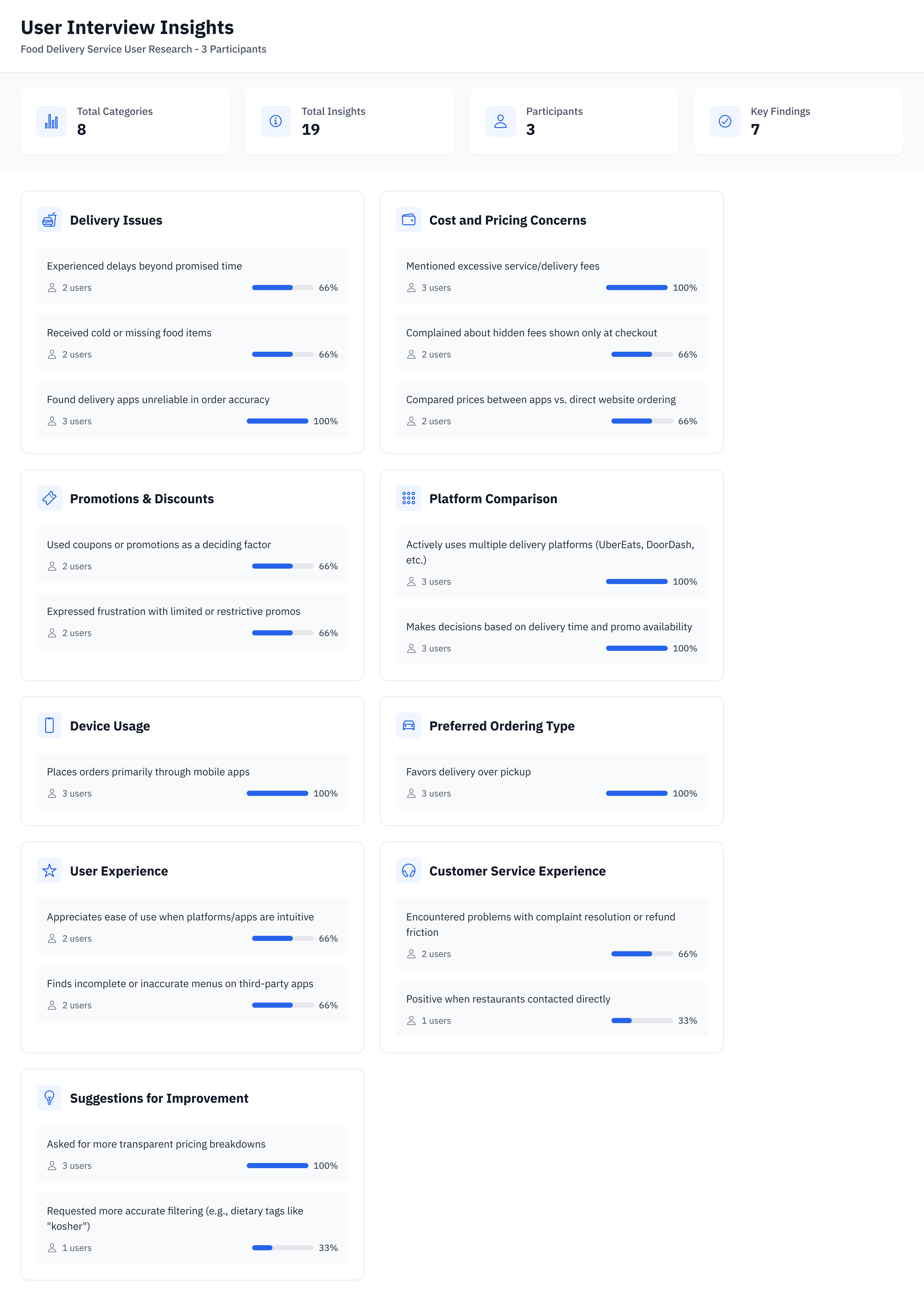
User Interviews:
To better understand user needs and validate our initial assumptions, we conducted Three user interviews with individuals who regularly order food online. Since Satvik Bakery operates exclusively in California, we focused on gathering insights from users across the region to ensure the research was locally relevant. Participants shared their experiences with browsing menus, customizing orders, and checking out on various food platforms.
This is a snapshot from one of the user interviews we conducted as part of the research phase. Our interviews focused on individuals who regularly order food online, including customers with dietary restrictions such as vegetarian, vegan, or eggless preferences. The goal was to understand their behaviors, frustrations, and expectations when navigating food e-commerce platforms—especially around ingredient transparency, custom orders, and checkout flow.
Key Findings:

Translating Interview Data into Actionable Testing
We initially conducted user interviews with participants who had previously ordered food online to understand their behaviors and pain points. Using the insights gathered, we then moved into the usability testing phase on the Satvik Eggless Bakery website to evaluate how well the current design supports real user needs.
Key Usability Findings
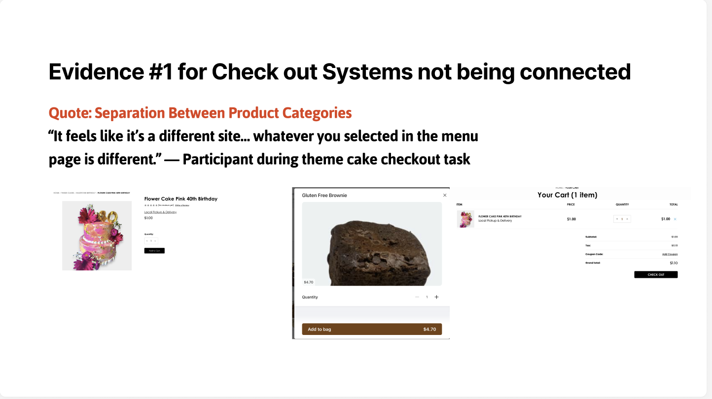
Problem Summary:
Users faced friction and distrust while trying to order theme cakes due to a fragmented checkout system, $1 placeholder pricing, and poor discoverability in the menu.
Business Goals at Risk:
Missed revenue from custom/theme cakes (typically high-margin items)
Reduced user trust = lower repeat orders and brand credibility
Increased customer support load due to confusion around pricing and ordering process
Key Performance Indicators (KPIs) — Framed Using Industry Benchmarks:
Based on industry benchmarks from the Baymard Institute, optimizing the checkout experience can reduce cart abandonment rates by up to 35%. Applying this to Satvik Eggless Bakery, we project a 20–30% decrease in abandonment, potentially recovering $12K–$15K in annual revenue and significantly improving user satisfaction scores.
Source:https://baymard.com/research/checkout-usability
User Insights:
Users expected all items (including theme cakes) to appear under one unified menu.
Several participants struggled to find birthday cakes and were confused by their absence from the main menu.
The placeholder price of $1 for theme cakes led to distrust and low confidence in the site’s pricing accuracy.
SAS score for Disconnected Theme Cake Checkout System:
Task Ease (Adding Cakes & Reviewing Pricing): 3.4/5 — Neutral, indicating minor friction.
Satisfaction with Pricing Transparency: 2.4/5 — Major concern; most users questioned the trustworthiness of the displayed pricing.
Impact:
The disconnected systems and non-functional pricing caused users to hesitate or abandon the custom cake ordering process, reducing trust and usability of a core feature.
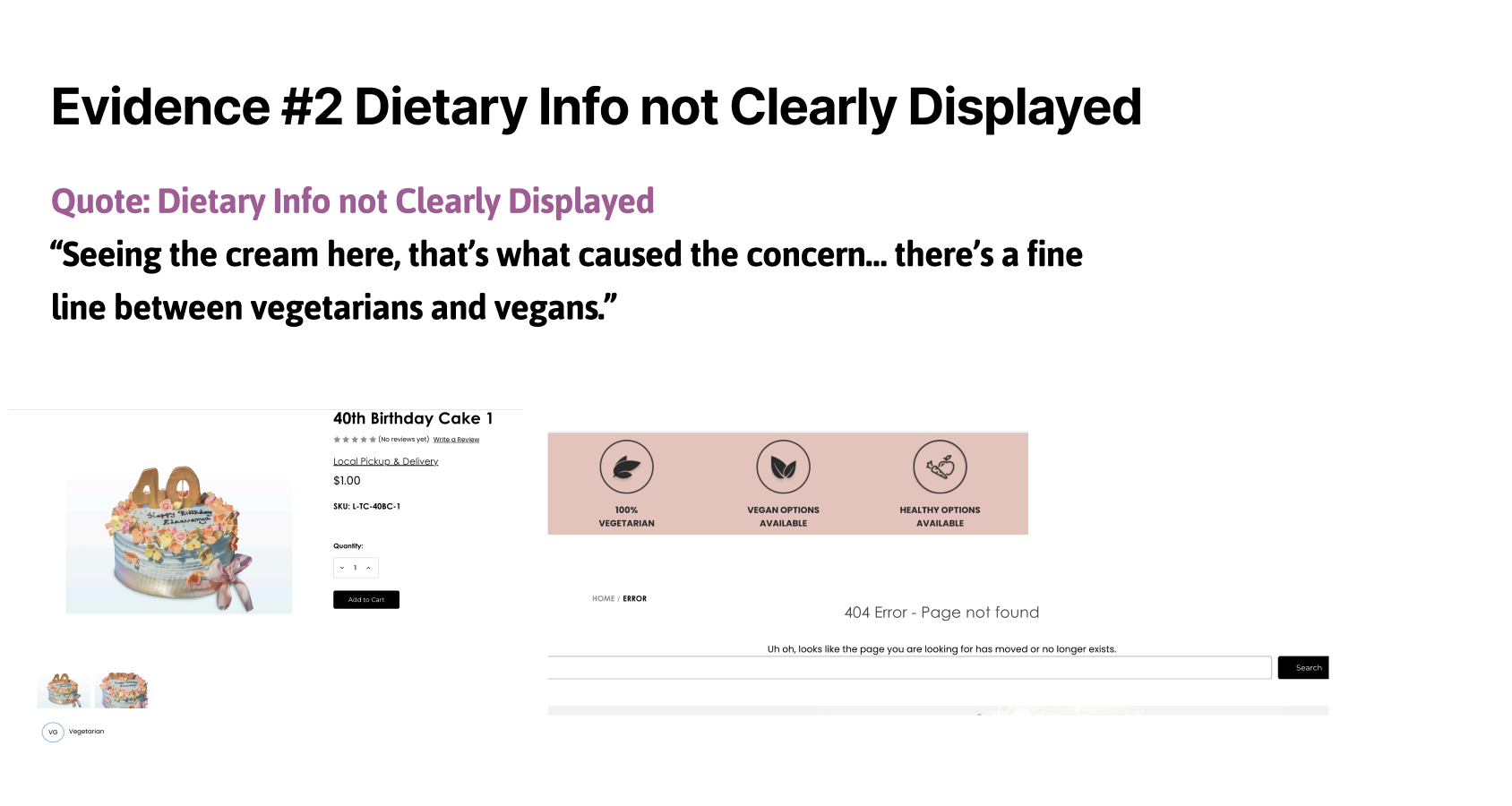
Problem Summary: Inconsistent Display of Dietary Information:
Satvik Eggless Bakery emphasizes eggless, vegetarian, and vegan offerings, but the website fails to consistently reflect this value in its UI. Across the product detail pages and menu listings, dietary badges (e.g., “Vegan,” “Vegetarian”) were often missing, placed too low, or not visually prominent, making it difficult for users—especially those with dietary restrictions—to confidently verify product suitability.
Usability Issue #2: Difficulty Checking for Vegan or Ingredient Info
Severity: Major
Clear ingredient and dietary labels are critical for users with food allergies, intolerances, or lifestyle-based preferences. The lack of consistent labeling throughout the site led to uncertainty and frustration during browsing and checkout.
Business Impact – Inconsistent Dietary Information
The lack of clearly displayed vegan, vegetarian, and allergen information led to user hesitation, lower trust, and abandoned sessions. For a bakery that markets itself around dietary-specific offerings, this inconsistency directly undermines brand credibility and erodes customer confidence—especially among health-conscious and restricted-diet shoppers.
Evidence-based insight:
Studies show that improving product labeling, filtering, and navigation can increase task success, engagement, and conversions by 10–30%, depending on severity.
Source:
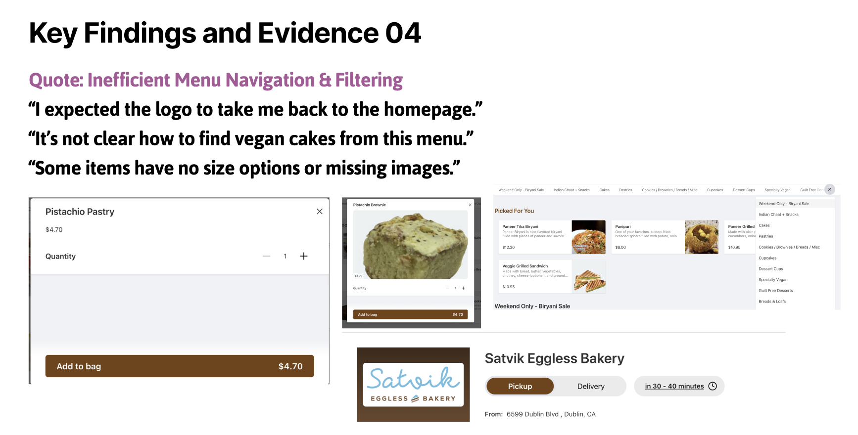
Usability Issue 3: Unclear Menu Navigation & Filtering
Severity: Minor (but frequent)
Summary: The menu layout lacks intuitive filtering and navigation. Dietary filters (e.g., vegan) are hidden in a sidebar, making them hard to find. Additionally, there's no direct link back to the homepage from the menu page, which breaks expected navigation patterns.
What We Observed:
Participants struggled to locate vegan or themed cakes due to unclear filter placement.
Users expected filtering options to be more prominent (e.g., top bar).
All participants noted the absence of a homepage link, which led to confusion.
One user explicitly requested more ingredient details directly on the menu for allergy awareness.
Business Impact:
Lost Sales Opportunities: Users unable to find specific items (e.g., vegan cakes) may leave without ordering.
Lower Conversion Rates: Friction in product discovery reduces the likelihood of completing a purchase.
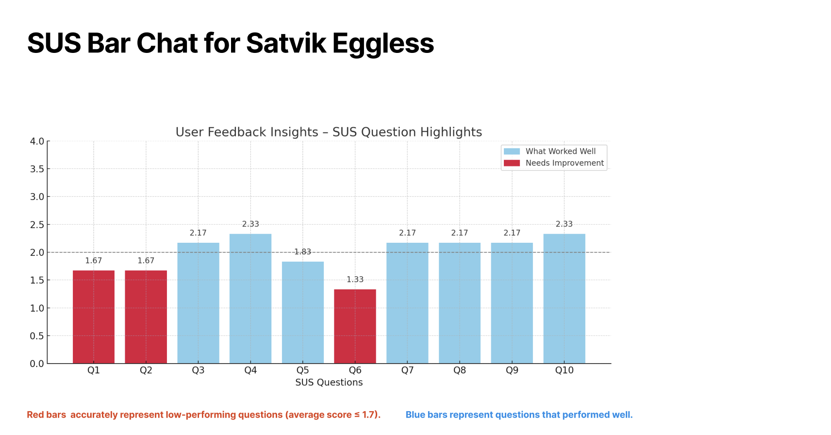
What Worked Well
Q3 - Q5
Q7–Q10
What Needs Improvement
Q1 & Q2 & Q6
Key Takeawys: This was an extensive UX research and design project conducted as part of my Master’s program, where I worked on a real, live website focused on promoting and selling eggless, Satvik (pure vegetarian) baked goods.
User-Centered Research: Conducted in-depth user interviews and surveys to understand customer preferences for eggless and Satvik food options.
Cultural Sensitivity: Gained insight into the importance of dietary values like purity, tradition, and ingredient transparency in Satvik baking.
Usability Testing: Tested prototypes with real users, iterated based on feedback, and implemented actionable improvements.
This project not only deepened my skills in UX research and UI design, but also taught me how to align design decisions with cultural values and dietary beliefs, creating both functional and emotionally resonant user experiences.
Evidence Based Persona: